Why take wrong photo's?
Wrong photo means that we break all of the composition theory for example 'filling the frame, rule of third, leading lines or any other compostions. This will make you a better photographer as taking wrong photos allows you to understand the photography rules before you actually break them. As before breaking these compositions you need deeper understanding of them. This makes you individual in your choice of photography as you will have completely different choice in your work which will make you a very unique photographer.
1.
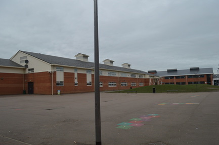
Here we see a pole as the centre of the focus however it isn't exactly in the middle of the frame which can make the picture have poor composition. However this picture does have vertical and horizontal lines which cross at a perpendicular angle, which makes the picture more interesting. This just shows how hard it was to deliberately take wrong photos.
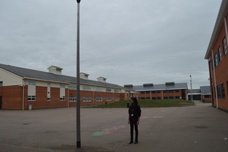
This image however could be interpreted to be a 'wrong photo'. As we can see the pole again but now we have a girl standing next to the pole, if there were to be another significant object in the picture we would have 3 objects which could be connected into a triangle. However due to the building not being a sharp enough object at the back of this picture we can not use this as the third object. Although there is a lot in the photo especially as the building takes up most the view, there is a lot of empty space around it.
3
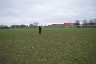
In this image we see very large frame however the girl is too far away for us to concentrate on her properly this goes against the theory of filling the frame. Zooming in flattens the perspective of the shot and makes it easier to control or take out what’s shown in the background. Also the landscape in this picture is very large as it takes up the entire frame and the girl looks very isolated and lonely, this will make the reader feel sad for the girl so the reader is able to understand the feelings of the girl.
WRONG PHOTOS IN CLASS
This photo is a wrong photo because here we can see the camera, which is not in the middle of the frame and in-fact on the side of the frame, along side we can see a very faint drawing of the little girl. If there was to be another item in the frame it would be a rule of third as we could make a triangle out of them. Also one of the object (camera) is much larger than the other so it doesn't work proportionally because the girl is so small compared to the camera. She looks much inferior to the camera making us sympathises with the drawing which then adds an element of emotion and empathy towards her.
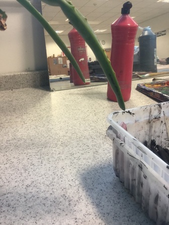
In this picture the objects are not in the centre of the photo which means that it doesn't frame the image as it does not fill in the frame. Also this picture is visually peculiar because we do not know where the green leaves that appear at the front of the image comes from as we haven't captured them. We can also see that on the right side of the photo there is a lot going on and it can seem very untidy however on the left side of the photo, it looks very empty and looks very bare. Also the colours in this picture are very vibrant and colourful as we have a lot of reds and greens which adds an element of excitement and thrill to the photo.
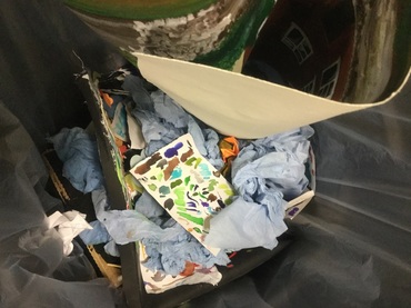
This photo is visually untidy and makes our eyes unable to find one focus point where we could look. Due to the messy view the audience are unable to see what the photographer is trying to show and what the main intentions behind this photo actually are. Also as the audience looks down into the bin it makes the viewer feel much more significant than the objects themselves.
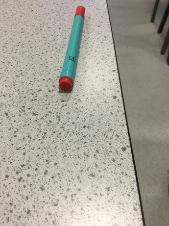
This picture shows the pen to take up only little of the surface area of the whole picture, and we see a lot of empty surroundings and it is just off the centre of the photo. Also this will make the reader feel sorry for the pen as it looks more isolated and alone which has an influence in the audiences feelings. This photo also looks vey peculiar as it looks likes it has been cropped out and unfinished. Also the pen is not the centre of focus and is instead slightly off to the right.
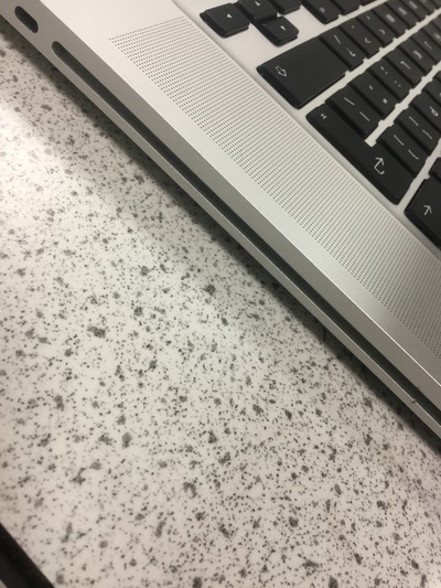
This picture visually looks very unattractive due to the heavy use of greys and whites, this means that there is nothing that stands out for the audience to grab their attention. Also there is also a lot of empty space where nothing is happening for example the front of the image. If the Mac was filling the frame this picture would be much more interesting as it would be the central focus because here there is nothing in particular the audience can look at.
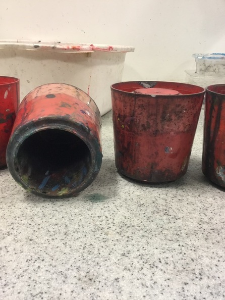
This picture could have been a good photo if all of the paint pots were standing up, due to one of the pots being laid down, it doesn't follow the pattern which can interrupt the harmony in this photo. Also if there was depth of field in this photo, we could have only the pots in focus which would have made this photo much more interesting.
