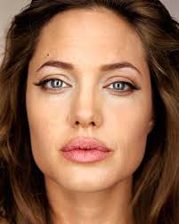
Example of Martin Schoeller work
My work
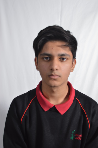
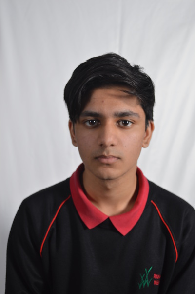
This photo was one of the earlier ones therefore the focus and the execution of the photo itself is very poor. Also the photo lacks shadows, only appearing near the neck of the model, this was because there wasn't enough sharp light hitting the model and this resulted in a fairly dim photo with hardly any light. The umbrella light here was more brighter than the standard studio light this is why this image lacks a 'warm glow' on his face and his right side of his face appears more pale. This is why the rightsize of his face appears more brighter than the left side, which looks like a shadow has been casted upon it. I had moved the trip-pod more closer to the model himself to insure that just like Martin Schoeller, the artist that I was trying to copy, I didn't want to include the background as I wanted the focus solely on my model. I would however like to have include more depth of field as here, instead of the foreground being on focus the backdrop appears to be more on focus. However with my later photos this has been improved as this was just one of my first try.
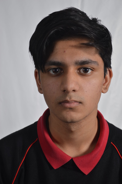
This image is however much more in focus as we can see the sharp features of the model, also just like Martin Schoeller his eyes are seen to be very captivating and is the most central feature of this whole picture. However still, as the focus isn't too great and neither is the approximaty of the camera and the subject it isn't as great as it could be this is why I prefer the next picture out of the three. Therefore I prefer this picture, over the image above however I still do not have shadows which are clear and evident and this is probably because I didn't change the position of the lights and instead focused too much on trying to focus the camera on his face. Also here the background is evidently not in focus and the more important subject is in focus. It really works well as the colour of the wall and the colour of his jumper act as an oxymoron as the black and the white act like contradictory colours. Therefore this image looks and very similar to my artists work.
Out of all the photos this has to be my favourite and this is mainly due to the amount of close analysis we can make when we instantly look at this picture. For example the models face is pretty much in focus and as we are zoomed in more close, I can easily identify his features. Due to the close approximation of the camera and the subject, his eyes that are staring into the camera look much more captivating and seem much more inviting and are place roughly in the middle of the frame which make it the central focus. Here also the shadows on his neck looks much more clearer and more sharper and this gives him a more 3 dimensional view which give the image as whole a new angle. As his face holds no expression and his face is sitting at a monotone expression the eyes can speak out much more to the camera which can act as a connection between the audience and the subject. By casting no warm glow on my subjects face and just the pale studio light it gives a clean feel to the photo and can make the subject appear more vulnerable and innocent. Although his eyes are situated in the middle of the photo his head is not placed directly in the middle of the frame and this is because I wanted to follow one of the composition theory of not placing things in the middle however I forgot that my artist actually does place his subjects directly in the middle so if I was retake this photo I would intact break the composition to follow my artists work.
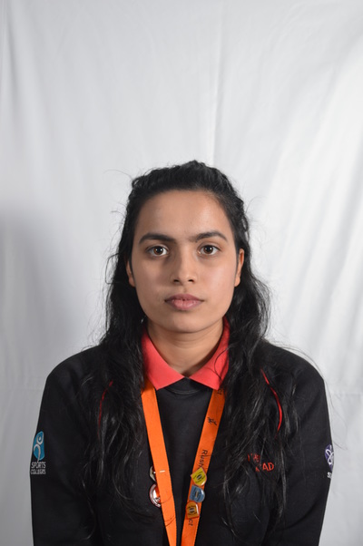
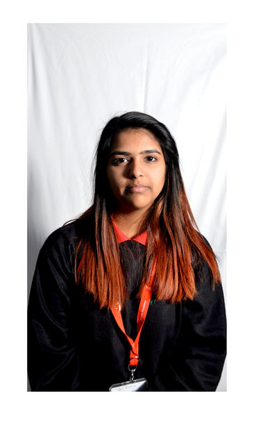
In this photo there is a glimpse of shadow appearing to the left of the frame however it isn't very dominant as the light isn't sharp enough for the shadows to fully show. In this photo the subject is placed approximately in the middle of the frame which compliments my artist work very well as it follows the pattern. We can clearly see where the light was shining the brightest at and this is because the right side of her face is more shiny and the shadow is casted to her left this shows us that the light was coming from the right side of the frame. Also we know that the light used was a camera light and this is because we know that they are commonly used to make the face more bright and shiny and the other standard studio light cast a much orange/warm glow and this again isn't present here. This is why the left side of her face appears to be more darker than the right side of her face and overall in the frame the right side is much more lighter/brighter then the other side of the photograph.
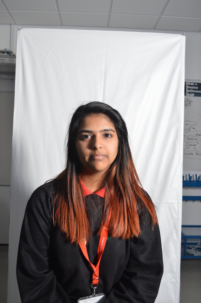
In this photo I have clearly not zoomed in very well and this has produced a very poorly executed photo as the background is visible and this creates an overall very cluttered photo and you can not fully place your attention on the subject and your eyes are left wondering around the frame. Also there is hardly any shadows and this is due to the lack of strong light hitting the subject and this overall creates a very boring image with out any dimension. Due to this, although the subject is looking at the camera it does't hold the same inviting nature as the previous as it is blinded by the classroom light. There is no particular side of her face that appears to be more brighter or darker than the other side. Therefore this is my least favourite photo.
|
ORIGINAL PHOTOS
|
PHOTOSHOP
|
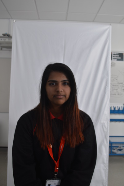
Although this image is still not very zoomed in so that we can really concentrate on the persons features, so that being one of the things that I would like to change because the focus and everything looks to be fine however as we are not close enough to the subject we can not really see these features. However I have clearly decided that the previous picture was too boring so I decided to involve the lights. Here we can clearly see a stake of show going across at horizontal slant cutting the picture in half. This shadow however isn't too effective as only the lower half of her visible body is under the shadow and this does not show us anything however this shows that I can use and create shadows well. Also when looking at her face we can clearly see that the left side of the photo is clearly much darker than the other side this again makes the image appear more 3 dimensional. The right side of the photo is very shiny due to the heavy use of the umbrella light and this is clearly evident in this photo.
This again isn't a very well executed photo and this is because there is a massive lack of light and the whole image is submerged into darkness, so much so that not only is there no visible shadows there there is also no source of light which makes this image extremely dull and dark. The background is still visible which results in a very cluttered and messy looking photo. This dark colour overall has a very negative influence on the photo as almost everything seems to be non-visible and this means that there is no focus point for us the audience to look at. I can tell that the only light that is used here was either the natural light from the window and the normal classroom lights.
