Photoshopping Leicester
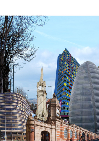
Collage one
In this Collage I have put together all the buildings in Leicester thad I do not like. For example the blue premiere inn hotel building, the train station and the space centre. I dislike these buildings as their aesthetic is very plain and boring and the colours mostly consists of light grey or pale blues and browns. Especially the blue Premiere Inn hotel, as the blue does not work with the mismatched colours of the yellow and red windows. The windows are also not placed on a particular pattern instead are put together in a random pattern which overall makes the building look very untidy and very messy to look at. To give it a sense of plain and boringness I have also made the colour of the train station and the blue building a bit lighter to make it look as if the colour is wearing out. I overlapped the buildings by putting the pages on top of each other to make it appear at the front of the screen.
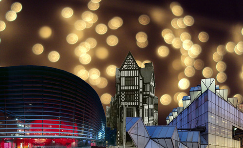
Collage two
In this collage I have put together a few buildings in Leicester that I think are the most aesthetically pleasing. For example the curve theatre in town has very rich colours which makes it stand out amongst the other boring buildings. which looks very colourful and very bold and bright. Also the background has a very bright colours which only add to the excitement of the picture. I have made this look very nice by using images that are very bright and very different than the everyday building. For example the building in the very right is one of a kind as it is very different when comparing to normal buildings in Leicester as it has abstract shapes that are very sharp and edged.