*GOLDEN RATIO AND RULE OF THIRD AT THE BOTTOM*
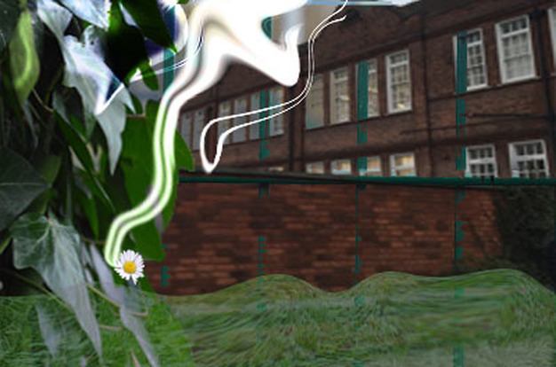
In this piece of work I have used a number of Photoshop skills to add the elements that we have learned through our first portfolios-Architecture. My main aim was to create something quiet simple but use all the different skills that I have learned throughout my first topic, I also wanted to include one piece of photography from the many small topics that was embedded into Architecture. For example nature, school shapes, light work and of course buildings. This is why my very first layer here was the ‘what looks like a 19th century school building with bricked walls but very interesting looking pointed roofs which again made it look much different to other buildings. I used Ctr+T to transform the image and used the magic tool button to take away the unwanted sky and other buildings at the back. I slightly darkened the image, as I wanted to add an element of light so that it contrasted against the lightning from our light work and the bright green from the nature at the front. Also darkening the already brown and monotonous building only enhanced the sheer unoriginality of its colour and this is exactly what I wanted to include as my background layer.
The next layer was something that I wasn’t completely sure on actually using as I thought it would distract and stray the audience from the first layer. I had taken a picture of the green fencing around the fields in school during a lesson where we had to take pictures of the different shapes around school. I liked the vertical lines so much that I decided to take away almost all the horizontal lines using the magic brush tool and lay this on top of my building. Initially the bright deep green looked really professional overlapping the brown building as the two colours complimented each other very well as these combinations occur in nature (a tree has a brown bark and green leaves). However, I didn’t like the way it was blocking the building so I decided to blur this into the first layer using layer masks, therefore in some parts of my work, it is heavily faded however in most parts it is still visible. This is what I wanted as I still wanted to show off my shape work but didn’t want it blocking the main architecture at the background. This was when I noticed that all the lines so far in my work were very sharp either vertical or horizontal lines and although this made it look very smart and professional I wanted to lay something on top which would add an element of fun and could be abstract.
This is when I decided to add one of light work skills, where we used a 3 second shutter speed to capture a ‘in motion’ light movement that we drew using a torch. Originally I had drawn a ‘S’ for my initial and because I didn’t want to include this shape in my work so I used the ‘liquify’ tool to change the shape completely. This meant that I could manipulate the original shape to make it more longer and reach down almost to the bottom of my background; I also rotated it to fit into the exact place that I wanted. So far I had included work from ‘Light, Shapes around school and of course architecture. I decided not to include more than one architecture building in my work, as I wanted to have a bit of everything and not make it too busy.
I now wanted to include a work from nature so I took a photo of a large plant and by using the magic brush tool I got rid of everything but the side of this specific plant that I wanted to include. I placed it on the side, as I wanted to give an idea of it creeping up and being there naturally. I made the end of this blend into the foreground and added another piece from the ‘drawing with light’ project to brighten up the top end of the plant. When placing them on top they also change colour to a green, which I really liked as, I thought it complemented the piece really well. By placing this on top of the building it gave off the impression that it was naturally growing there however I broke this illusion by making the lower half of it blur, I also wanted to take up approximately a third of the frame as I was thinking about including the rule of third into my final piece as it was topic we had just recently worked on. When I placed this there, initially it looked quiet weird as it disappeared into nothingness, which didn’t work with the photo.
This is why I decided to get a photo of an empty field and cropped until approximately a third of the grass from below was left behind. I wanted to mirror the shape of the swirly light so again I used liquify to change the shape of the grass to make it more unprofessional and have curved lines. Again using ‘Layer Mask’ I blurred the grass into the background so that the green fence is clearly visible including the main building at the back. This severely contrasted the sharp clean cut shapes of the bricks in the wall behind which gives it a two sided aspect to this piece as a whole.
At this point I thought that my Photoshop work was done so I copied a ‘golden ratio’ sheet front the Internet to overlay my work. When I did this I realized that as your eyes follow the curve at the end of the photo, and you follow the ‘swirls, there is nothing there that really captures you. This is when I got inspired to get something very petit and place here to make this photo complete.
I used a very small daisy as it looked very bright with its yellow and red and was bound to make it the centerpiece. Therefore if you look at my final piece with the golden ratio on top you can see that the daisy fits perfectly at the inner swirl. This was a trial and improvement process as I needed to make sure that the flower would be directly on top of the swirls. However I wanted something else connecting to it, so I made the ‘draw with light’ work more longer to end it just above the flower, which your eyes can follow to see the center piece, Also I have tried very hard to not place anything in the center of this piece, in fact if you look closer you can see that everything that is happening in the photo is to the left of the photo.
Which is probably the one thing that I would improve with this piece if I had the chance to do it again. This is because one side of the photo (left) looks very busy and cluttered whilst the right side is practically empty. This can make this piece look really unprofessional and possibly 'wrong'. However there are lines, vertically going across the entire page. In the ‘rule of third’ section of my work we can see that the swirl goes across the vertical meeting line and the plant is placed on the very left of the piece which takes up roughly a third of the final piece altogether.
One thing that I think went well was the choice of complimentary colours as these two colours, brown and green both appear in nature and work really well with each other. Also the white and yellow of the daisy makes it stand out among the rest of the other pieces which again shows you that it is the center piece. I also like how far the swirl of light travels up to in my page because by looking at the rule of third picture below, we can see that it is part of three of the grids and almost connects every aspect of my different pieces of work with each other so by following it you arrive at the different positions where all the projects are fused together.
Golden Ratio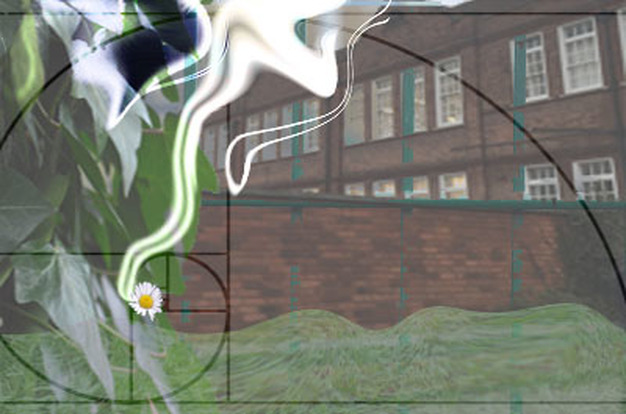
|
Rule of third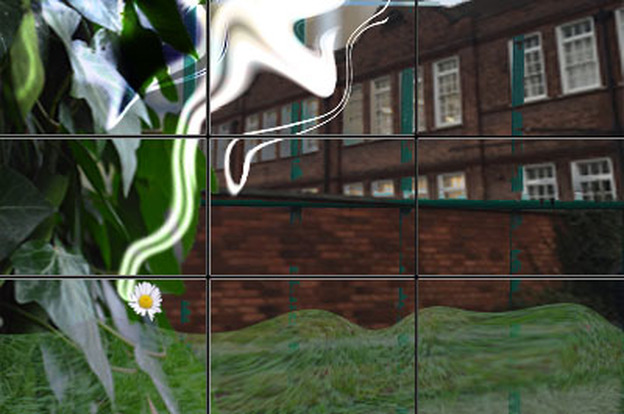
|
My final piece and what architecture means to me...
Architecture to mean something that can be very simple to the eye with intricate details and the artists personal views and choices inflicted onto the work. This is shown in my photoshop as we can see from the architecture at the back, initially it looks to be very plain, simple and lacks ambition however when looking at the small details we can see the intricate design especially on the roofs as the are all pointed and the building it self is covered in glass windows. Me being the photographer I do have a personal link with this building as it was my previous school therefore this is another element that I look for in a building. As I have said before my final piece is very simple with only green and brown colours which compliment each other very well, however although it can be seen as 'too simple' it is still interesting and can instantly grab your attention due to the large frame and the shapes of the roof and windows. Furthermore I know that most people stop to look at buildings that are aesthetically pleasing and can have bright, vibrant colours therefore I have changed the photo to make it little bit more interesting. For example adding the streak of light and adding vibrant greens and whites.
